Unfortunately, the idiom never judge a book by its cover doesn’t apply to websites. Websites are often judged based on how good their site architecture is. By “good,” we mean a structure optimized for both user experience and search engine visibility, which typically results in increased traffic.
But just how big is the impact of site architecture on organic traffic? How bad can it get for a website that fails to incorporate site architecture principles in its optimization efforts?
Through this case study, we made a shocking discovery: after months of stagnancy, a website’s traffic increased by 260% from conducting a simple internal linking analysis and applying the 3-click rule for site architecture.
An average of 4 to 6 links per page were added to over a hundred pages within a day. Here’s how we made it possible.
Key takeaways
- This case study observed an increase in organic traffic by improving site architecture via internal linking within four months.
- The principle of 3-click depth was implemented to flatten the site structure and ultimately drive traffic to important pages.
- A total of 176 pages were involved in this experiment.
- The homepage increased 260% in traffic from 370 views to 1,332 views.
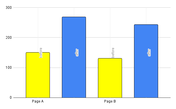
- Important page A saw an increase of 79% in traffic from 150 views to 268 views
- Important page B saw an increase of 87% in traffic from 130 views to 243 views
- The Beta version of LinkVector was used to audit the site and its pages, identify important pages, offer suggestions for internal linking, and automatically implement the recommended changes
The site architecture case study background
Site architecture is mainly constructed by linking the pages on your website together using internal links to create an organized and navigable website for both users and search engines.
One of the main principles of site architecture is to ensure that important pages are accessible with only a few clicks. If you have a target page that you want to drive traffic to, it should be easy to navigate to and not too far from the homepage.
SEOs refer to this as the 3-click rule—the ideal distance between the homepage and important pages is no more than three clicks away, promoting a flat architecture.
This is crucial because if a page is buried deep within the site architecture and requires more than three clicks to access, it can be challenging for users to find the page.
This was the situation with an unmaintained website we selected as the subject of this case study. We saw its shortcomings as an opportunity to demonstrate the impact of a flat architecture on organic traffic.
The subject of this case study
Choosing an unmaintained website as the subject was a deliberate decision we made based on the current state of its site architecture and the potential improvements we saw possible despite the conditions.
Our surface-level observations revealed the site’s deep architecture. Bottom-of-funnel content that’s important for conversions could not be reached within 3 clicks, as suggested by the 3-click rule.
This tells us that the content could attract traffic, but the deep site architecture impeded any results. We thought, what a huge waste of potential.
So, we wanted to address this issue because we believe transforming this under-optimized site to realize its potential would be an excellent case study.
What problems did we identify within the website?
Aside from our initial observation, we didn’t find any other issues with the groundwork, but we couldn’t be sure. We let this case study become a LinkVector Beta version testing ground to eliminate any guesswork and guarantee that all issues are identified.
We conducted an audit on the link distribution, page crawl depth, and page distribution to gain insights into the overall architecture and link performance for the whole site and each page.
The analysis revealed that most pages were buried too deep within the site, requiring an average of five clicks to reach important pages from the homepage, disregarding the 3-click rule.
This diagram is an illustration of what the site architecture looked like before our intervention.

With 176 pages in total, it would take us over a day to identify which were of what importance.
LinkVector took over our task and evaluated the quality and quantity of internal backlinks, PageRank scores, and internal link ratings to pinpoint important pages. This assessment identified 90 important pages, 66 standard pages, and 20 pages of lesser importance.
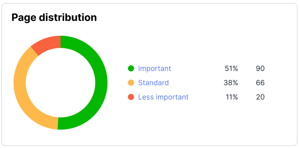
The important pages include, but are not limited to, comparison content, product demonstration pages, and blog posts.
Despite these pages making up more than half of the site, the distribution of links was inconsistent, as indicated by the gaps in the site architecture diagram.
The majority of links directed traffic to standard pages instead of important pages. It shows that some pages are interlinked with no clear hierarchical relationship with each other.
This was a huge problem, not just for site architecture but also for user navigation.
How did the 3-click rule flatten the site architecture?
From the analysis, we identified that the site had a deep architecture, a high click depth, and an uneven link distribution. The best approach is to use internal links to connect all pages in accordance with the 3-click rule.
We focused on the 90 important pages and developed the 3-click architecture based on LinkVector’s internal linking suggestions.
First, we got the internal linking suggestions for each page. Second, we used bulk actions to add the internal links to each page. Third, we used LinkVector to analyze and verify how links are distributed across different pages. It was as easy as that.
The new link distribution data shows that 12.20% of links were linked to less important pages, 32.93% were linked to standard pages, and 54.88% of links were linked to important pages.
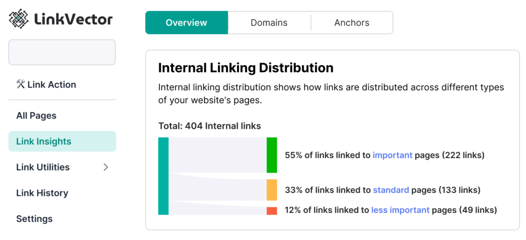
This suggests that links are organized by page significance, with important pages receiving a greater number of links.
The homepage is now linked to 20 pages within one click at 4 to 5 links per page, 54 pages within 2 clicks at 6 to 7 links per page, and 90 important pages within three clicks.
The illustration will help simplify the data.
Observe that the distribution of links from one page to another is considerably more balanced, and the architecture is flatter.

The remaining 12 pages are less important pages, such as articles with outdated content, positioned at a higher click depth.
What other factors were taken into consideration in this case study?
Our main emphasis is on the site architecture, though we acknowledge that secondary factors may also influence the outcomes following the primary implementation.
We have considered the site’s content a crucial determinant of our experiment. Without it, restructuring would be nearly impossible.
While we modified, added, and removed internal links, we did not intentionally alter the existing content to enhance topic depth, thematic coverage, or related aspects.
Furthermore, we made no adjustments to the content’s on-page SEO or existing external links and backlinks.
These factors may or may not impact the final results in ways that are beyond our control and active monitoring.
How did we track and measure the traffic changes?
The website was tracked, measured, and documented for traffic changes for four months, from January 13th to May 13th, 2024. Initially, traffic on January 13th was recorded at 370 views, with the three-month average prior to this experiment also standing at around 370 views. You can refer to the image below.
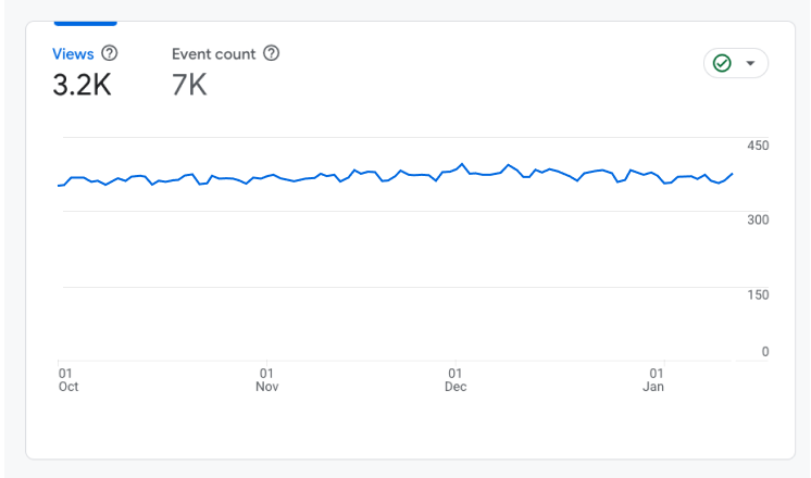
To assess if the 3-click architecture effectively increased traffic to important pages, we also monitored two important pages, labeled page A and page B, for any significant rise.
The stagnancy in the traffic data for the whole site and these two pages served as a controlled variable for us to confirm that any changes recorded within the experiment date were a result of our flat-architecture implementation.
What results did we achieve following the 3-click rule implementation?
To determine the impact of improved site structure via internal linking on organic traffic, we calculated the percentage of increase in traffic by comparing initial and final traffic data. We’ve broken down the data into easier-to-read charts for better visualization.
The traffic recorded on the last day of our observation shows an increase from 370 views to 1,332 views. That’s a 260% increase in four months, as shown below.
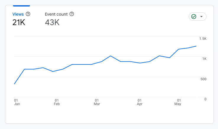
The two important pages under monitoring also showed an increase in pageviews.
Page A shows a 79% increase from a stagnant 150 views to 268 views. Similarly, page B had an 87% increase from 130 views to 243 views. That’s a success.
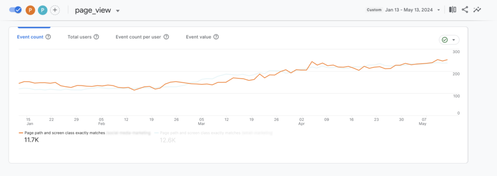
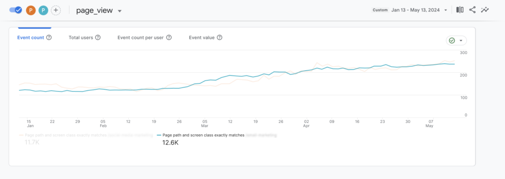
Here’s a chart that compares the two pages’ changes in traffic before we implement the 3-click rule to help you visualize the impact better.
What do the results say about flat site architecture?
The noticeable increase in page views clearly demonstrates that a flat site architecture significantly enhances navigation efficiency, which, in turn, improves the overall user experience.
We can also see that the surge in views for important pages suggests that fewer clicks make these pages more accessible. No matter the specifics of your content strategy, there are always key pages you want users to visit to take a specific action, whether it’s subscribing to a newsletter, making a purchase, or booking an appointment.
Positioning important pages near the homepage (or authority pages) is generally beneficial to enhance visibility and access.
Final reflections and remarks
This case study has effectively demonstrated that when internal linking is executed correctly, it enhances site navigability, makes target pages more accessible, and ultimately contributes to an optimized site architecture.
While we used the 3-click rule to guide our efforts in flattening the site architecture, it’s important to view this rule as a guiding principle rather than a rigid standard. There are numerous scenarios where this type of architecture may not be applicable.
Finally, we attribute much of the success to LinkVector. It handled everything from auditing to suggesting and even automatically implementing changes in just minutes. Had these tasks been done manually, we wouldn’t have been able to gather and analyze data quickly enough to provide you with timely insights.
If you need an internal linking tool that offers easy, fast, and precise data-driven insights tailored to your content strategy, LinkVector is up to the task. As demonstrated in this case study, it has proven its ability to deliver results.
Until next time.

Leave a Reply